State Farm Mobile
State Farm lacked a true flagship mobile app. Furthermore, the mobile portfolio of apps lacked consistency in aesthetics, brand language and interaction models. The company struggled to maintain the program due to a growing volume of apps, and a lack of communication across teams of designers and developers who occasionally updated an app on a case by case basis. As a consequence of this, customer needs were not being met and competitors began to dominate the medium. State Farm brought me on board to solve these problems as Creative Director of Mobile.
Approach
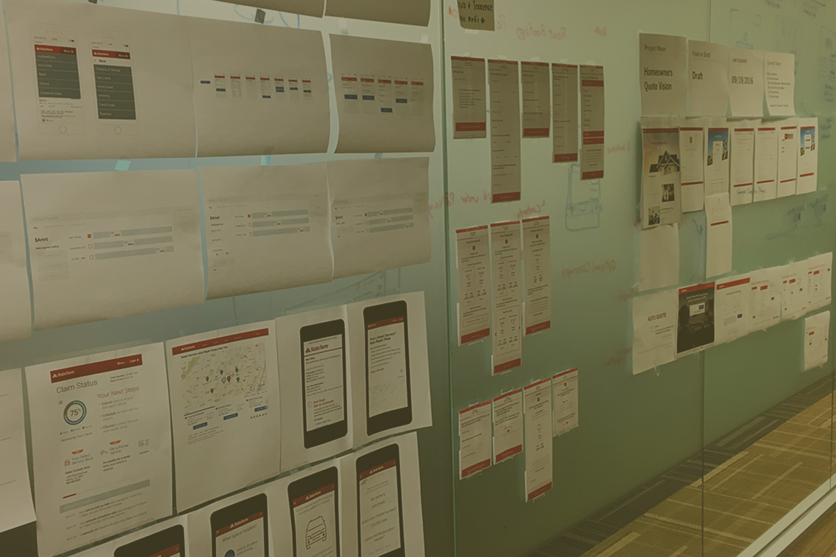
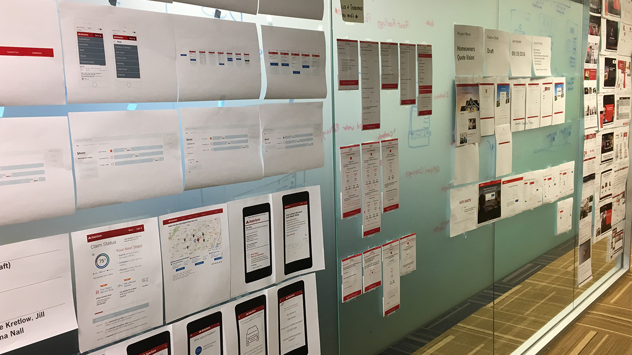
- Brought together siloed design teams to conduct a full program audit of all design patterns in our products to champion communication and identify key patterns for a design system.
- Organized cross-functional workshops with engineering to inspire advanced capabilities in native platforms to designers.
- Challenge status quo with out-of-box concepts that require design team to think different.
- Champion visionary thinking to business analysts and user research departments.

Measures of Success
- Growth of installs and usage statistics among native apps.
- Category leadership in mobile app stores.
- Reduction in call center volume.
- Customer feedback / ratings to show positive trend.
Solutions
01
We launched the Native Pattern Library to provide guidance to design teams throughout StateFarm and to ensure consistency across our portfolio. The NPL covered everything from iconography, typography and grids to authentication flows, voice interaction (VUI) models and dataviz. It was a privilege to partner with Kenneth Haynes, who led this project - a brilliant UX designer and ambitious strategist.


The audit spread all around the building, with web and brand media joining in on the fun.

Coincidentally, the brand team was revising style guides so it was the perfect time for creative leadership to join together and contribute brain power across the entire portfolio.
02
Drive Safe & Save (DSS) is/was State Farm’s #2 most popular mobile app. It’s a tool for personal driving metrics that can result in policy discounts for good drivers. Previous versions of the app were not very interesting, so I challenged the status quo with compelling dataviz aesthetics to compel the team to think differently. This started by mocking up some dramatically different visual concepts myself (below) to compel some creative brainstorming among the team.

DSS was redesigned with rich dataviz graphics and appropriate gamification experiences to make it fun.

03
Pocket Agent was State Farm’s #1 most popular app, which included banking, policy and claims tools. However, it was becoming antiquated. I saw this as an opportunity for a significant refresh and rebrand the app as simply State Farm - the flagship app we lacked. Taking inspiration from the DSS redesign, I helped champion the strategy and direction until this became an executive direction for a larger digital transformation project. It was a pleasure to work with Preston Kent on the first few rounds of visual design.

Outcomes
StateFarm mobile flagship app realized steady growth over its first year following release. Average user reviews in the app stores also rose significantly to over 4.8 average from 272,000 reviews as of Janurary 2021. The app also won three of the top honors at the 2020 Webby Awards. The app is now used by over 6 million customers and growing.


“ The app does it all and does it well. Insurance is some complicated data, and lots of data, but State Farm lays it out in an intuitive and informative way for me to manage claims, view payment schedules, view coverage details, all of it! ”
Ahsacv
Apple App Store (01/15/2020)